Typography - Task 1:Exercise
TYPOGRAPHY|Task 1:Exercises
|| Low Xin Er, 0374596
|| Typography
|| Exercises / Type Expression & Type Formatting.
2.4 Typo_2 Basic
3.3 Adjustments3.7 Animation3.9 Text Formatting3.11 Exploration & Draft3.13 Final Design


The Greeks changed the direction of writing.


Hand script from 3rd - 10th century C.E.


Blackletter to Gutenberg's type


The earliest printing type, its forms were based upon the hand-copying styles that were then used for books in northern Europe.
Examples: Cloister Black • Goudy Text

1475 Oldstyle
Based upon the lowercase forms used by Italian humanist scholars for book copying (themselves based upon the ninth-century Caroline minisule) and the uppercase letterforms found inscribed on Roman ruins, the forms evolved away from their calligraphic origins over 200 years, as they migrated across europe, from Italy to England.
Examples: Bembo • Casion • Dante • Garamond • Janson • Jenson •Palatino

1500 Italic
Echoing contemporary Italian handwriting, the first italics were condensed and close-set, allowing more words per page. Although originally considered their own class of type, italics were soon cast to complement roman forms. Since the sixteenth century, virtually all text typefaces have been designed with accompanying italic forms.

1550 Script
Originally and attempt to replicate engraved calligraphic forms, this class of type is not entirely appropriate in lengthy text settings. In shorter applications, however, it has always enjoyed wide acceptance. Forms now range from the formal and traditional to the casual and contemporary.
Examples: Kuenstler Srcipt • Mistral • Snell Roundhand

A refinement of oldstyle forms, this style was achieved in part because of advances in casting and printing. Thick to thin relationships were exaggerated, and brackets were lightened.
Examples: Baskerville • Bulmer • Century • Time Roman

1775 Modern
This style represents a further rationalization of oldstyle letterforms.
Serifs were unbracketed, and the contrast between thick and thin strokes extreme. English versions (like Bell) are also known as Scotch Romans and more closely resemble transitional forms
Examples: Bell • Bodoni • Caledonia • Didot • Walbaum

Originally heavily bracketed serif, with little variation between thick and thin strokes, these faces responded to the newly developed needs of advertising for heavy type in commercial printing. As hey evolved, the brackets were dropped.
Examples: Clarendon • Memphis • Rockwell • Serifa

As their name implies, these typefaces eliminated serifs alltogether.
Although the forms were first introduced by William Caslon IV in 1816, its use did not become wide-spread until the beginning of the the twentieth century. Variation tended toward either humanist forms (Gill Sans) or rigidly geometric (Futura). Occasionally, strokes were flared to suggest the calligraphic origins of the form (Optima). Sans serif is also referred to as grotesque (from the German word grotesk) and Gothic.
Examples: Akzidenz Grotesk • Grotesk • Gill Sans • Franklin Gothic • Frutiger • Futura • Helvetica • Meta • News Gothic • Optima • Syntax• Trade Gothic • Univers

1990 Serif/Sans Serif
A recent development, this style enlarges the notion of a family of typefaces to include both serif and sans serif alphabets (and often stages between the two).
Examples: Rotis • Scala • Stone
2.2 Typo_3 Text part 1

Kerning: space between two alphabet
Tracking: balance space between every alphabet in word
3 ways:
- Option +left arrow key
- Preference> type> unit& increments >reduce kerning/tracking:20to5 >move more slower to adjust
- Command shift < or >to adjust word’s size

Uppercase letterforms: strong resistance,stand on their own
Lowercase letterforms: maintain the line of reading
Alignment
- Flush left: ragging to right
- Centered: symmetry,prefer small amounts of copy
- Flush right: ragging to left,exp:situation,caption
- Justified: expanding spaces between words(careful attention to line breaks),exp:reflection

Fig. If you see the type before you see the words,change the type.
Text/Texture
It is important to understand how different typefaces feel as text and suit different messages.
Text layout

Larger x-height easier to read

Type size: Large enough to be read easily at arms length
Leading
- Too tight: Vertical eye movements
- Too loose: Creates striped patterns to distract the reader from the materials
- Line length: A good rule of thumb is to keep line length between 55-65 characters.
- Size:10/12 is standard color of text for reading comfortable.
Type specimen book

Compositional requirement:
- Occupy a page or a screen
- Having a middle gray value
- Not a series of stripes
“Nothing replaces looking closely at an actual print out of your work.”
"Typography is all about details."
Indicating Paragraphs (paragraph space)
Pilcrow: a holdover from medieval manuscripts seldom use today

Line space(leading) :space size pt same with paragraph size.
Exp:
- Text point is 10,leading should be 12 or larger
- Text point is 12,leading should be 12 to be balance (in two column)
Cross align
Exp
- Text 10pt /leading 13pt
- Select all the paragraph, click pilcrow and set it into 13 pt
- Second column content will perfectly cross align


Avoid mistakes
- widow: short line of type left alone at the end of a column of text
- orphan: short line of type left alone at the start of new column

Solution
- widow: rebreak the line endings throughout the paragraph so the last line of any paragraph is not noticeably short.
- orphan: make sure no column of text starts with the last line of the preceding paragraph.


Fig. Change type family / colour (black,cyan,magenta and yellow)


Quotation marks
Bullets: create clear indent


Fig. exp leading20,headline24pt=make alignment of headline and paragraph to be the same.
Describing letterforms
- Baseline: imaginary line the visual base of letterforms
- Median: defining the x-height of letterforms
- X-height: height in any typeface of the lowercase”x”

Stroke: defines the basic letterform
Apex/Vertex: the point created by joining two diagonal stems

Fig. apex=above,vertex=below
Arm: short strokes off the stem of the letterform


Barb: the half-serif finish on some curved stroke


"To work successfully with type,you should make sure that you are working with a full font (typefaces) and know how to use it."
The font
- uppercase: capital letters,certain accented vowels
- lowercase: include same characters as uppercase


Uppercase numerals
- Lining figures,same height as uppercase letters,set to the same kerning width.
- Successfully used with tabular material or any uppercase letters.

Lowercase numerals
- Old style figures or text figures,set to x-height with ascenders and descenders.
- Best used when ever use upper and lowercase letterform.
- Far less common in sans serif type-faces than in serif.

Italic: Oblique are typically based on the roman form of the typeface.

Italic vs Roman

Punctuation.miscellaneous characters

Ornaments: flourishes in invitations or certificates

Fig. Adobe Calson Pro contain ornamental fonts as part of the entire typeface family.

Simple design of typography can make it suited to a variety of purposes but too charactics will shorten its survival.
"You can’t be a good typographer, if you aren’t a good reader. " -Stephen Cole
Letters/Understanding letterforms
- Uppercase letter forms below suggest symmetry but in fact it is not symmetrical.Two stroke weights of Baskerville stroke are different and each bracket connecting the serif to the stem has a unique arc.

- Close examination shows that the width of the left slope is thinner than the right stroke, making it harmonious and individually expressive.

- Helvetica and Univers.Comparison of how the stems of the letterforms finish and the bowls meet the stems quickly reveals the palpable difference in character between the two.


Maintaining x-height
- Curved strokes such as in ‘s’ must rise above the median(or sink below the baseline) in order to appear to be the same size (visual) as the vertical and horizontal strokes they adjoin.


Counterform
- Important as recognizing specific letterforms is developing a sensitivity to the counterform (or counter).The space is described and often contained by the strokes of the form.When letters are joined to form words,the counterform includes the spaces between them.
- How well you handle the counters when set type determines how easily people read what’s been set.

- Examining letters in close detail provides a good feel for how the balance between form and counter is achieved, a palpable sense of letterform’s unique characteristics and a glimpse into the process of letter-making.

- The sense of the ‘S’ holds at each stage of enlargement while the ‘g’ tends to lose its identity as individual elements are examined without the context of the entire letterform.
Contrast
- The most powerful dynamic in design-as applied to type based on a formal devised by Rudi Ruegg.
- Simple contrast produces numerous variations:small+organic/large+machined; small+dark/large+light…


Different medium


- In the past,typography was viewed as living only when it reached paper.Once a publication was edited,typeset and printed,it was done and nothing changed after that.Good typography and readability were the result of skilled typesetters and designers.
- Today,typography exists not only on paper but on a multitude of screens that are subject to many unknown and fluctuating parameters:operating system,system fonts,the device,screen itself,the viewport and more.Our experience of typography today changes based on how the page is rendered because typesetting happens on the browser.
Print type vs screen type
Type for print:
- Designed for reading from print long before we read from screen.Must ensure that the text is smooth,flowing and pleasant to read.
- Common typefaces: Caslon,garamond,Baskerville
- Their characteristics are elegant and intellectual but also highly readable when set at small font size.Exp brand Burberry

Type for screen:
- Intended for use on the web are optimized and often modified to enhance readability and performance on screen in a variety of digital environments.Include a taller x-height (reduced ascenders/descenders),wider letterforms,more open counters,heavier thin strokes and serifs,and modified curves and angles for some designs.
- Type for screen: Georgia,Verdana
- Typefaces intended for smaller sizes are more open spacing.It improves character recognition and overall readability in the non-print environment,which can include the web,e-book,e-readers and mobile devices.
Hyperactive Link/hyperlink
- A word/phrase/image that can click on to jump to a new document/section within the current documents. It allows users to click their way from one page to another.
- Text hyperlink are normally blue and underlined by default.When moving the cursor over a hyperlink,whether it is text or an image,the arrow should change to a small hand pointing at the link.
Font for screen
- 16-pixel text on a screen is about the same size as text printed in a book or magazine;this is accounting for reading distance.
- Text printed is typically set at about 10 points. If you want to read them at arm's-length, you need at least 12 points, which is the same size as 16 pixels on most screens.
System Fonts for screen/web safe fonts
- Each device comes with a different pre-installed font selection. If you don't have that font installed and it’s not pulling from a web-friendly place,the font would default back to some basic variation like Times New Roman and it would just look plain ugly.
‘Web safe’ ones appear across all operating systems.They’re the small collection of fonts that overlap from window/mac/google.
- Open Sans
- Lato
- Arial
- Helvetica
- Times New Roman
- Times
- Courier New
- Courier
- verdana
- Georgia
- Palatino
- Garamond
Pixel differential between devices
- The screens used by our devices are different in size and proportion because they have different sized pixels.100 pixels on a laptop is very different from 100 pixels on a big 60’’ HDTV.
- (even within a single device class there will be a lot of variation)
- (But don't just choose using safe mode to design on screen)

Static vs Motion
Static:Expressing words,offer a fraction of the expressive potential of dynamic properties by using bold and italic.

Motion: Dramatize type for letterforms to become ‘fluid’ and ‘kinetic’.motion graphics particularly the brand identities of film and television production companies increasingly contain animated type.
- Exp:music videos,advertisements,following the rhythm of a soundtrack.
- Aim:establish the tone of associated content or express a set of brand values.
- Note:must prepare the audience for the film by evoking a certain mood.
“A great designer knows how to work with text not just as content,he treats text as a user interface.” - Oliver Reichenstein


- Can combine JUMP ver1 and ver4 = Step motion & bounce motion
- Cheese melt and butter melt express is really interesting no need adjustment,will be assist for digitalise and animate later.
- CHILL words can't get the feels of relax.should change the meaning of it to be cold and design it in a new perspective.
- ROLL ver2 & ver3 is good.ver 2 is rare while ver3 can adjust to make the circle falling down from capital letter of R so the animation will be interesting.


3.7 Animation - JUMP


Adobe Illustration Notes (tutorials)
- Option bar is at the top
- Control bar is at the second top, needs to be opened manually from the window
- Black arrow changes the size of the element
- White direct arrow directly controls the point of the square, only changes one point
- Select the text you want and right-click Create Outline to turn your text into a shape
- Keyboard A shows a controllable point (white mouse) to change the shape of the text.
- - After turning the text into a shape, it cannot be changed back to an editable font
- - You can click on individual letters in the layer to move and change
- Create a new artboard in the lower right corner of the artboard
- You can unlock the layer to prevent accidental touch and move
- Unzip the file first
- Android: Select all files, right-click install
- iOS: Open the file otf, click to open and download the font from fontbook
- Click option to drag the element to be copied
- Ctrl+Ctrl F to ensure that the copied element is in the same line/grid
7.1.Normal typing
- Click to type infinitely long until the enter key is pressed
- Features: You can drag the grid to enlarge the font
7.2.Section writting
- Create a grid, and the paragraph will only appear in the grid with automatic blank lines
- Features: You cannot drag the grid to enlarge the font
8.1.Touch type tool (shift t)
- Click the letter you want to change to display a box, and change the position, size and rotation at will
- Features: You can still edit the font
8.2.Manual method- Window > type > character
- The window that pops up can view the font type, and you can manually adjust the rotation angle and shape.
- Curning controls the space between individual letters
- Tracking controls the space between all letters
- Select text option Click the keyboard to the right = expand
- You can select individual letters to control
10.1.Shape builder tool (shift M)
- Select all shapes, select and drag to link all shapes, and adjust the edges
10.2.Freetransform tool
- Perspective control points change the perspective design
10.3.Wap tool
- Turn the text into a shape first, wap option bend, and you can freely adjust the nodes
- create artboard as frame
- use ctrl+c and ctrl+f to make sure elements is aligned
- more frame the animation more smooth
- export as all artboard>jpeg>72ppi
- file > scripts > load files...> browse > select all the jpeg > wait import
- window > timeline > (below) create frame > add frame as amount as we need
- click frame 2 > close layer 1 to show frame 2 > repeat until last frame
- adjust duration of frame under each frame
- erase the extra elements by using eraser/white brush/select and delete
- export as > web > gif > screen 72ppi
3.8 Kerning,Tracking and Leading
3.9 Text Formatting
1.One of the design:
Typeface: Bembo Std
Font/s: Bembo Std Bold
Type Size/s: 72 pt
Leading: 36 pt
Paragraph spacing: 0
BODY
Typeface: Bembo Std
Font/s: Bembo Std
Type Size/s: 9 pt
Leading: 11 pt
Paragraph spacing: 11 pt
Characters per-line: 57
Alignment: left justified
Margins: 123 mm top, 26 mm left + right + bottom
Columns: 2
Gutter: 10 mm
2. Things to look out for when completing Task 1, Exercise 2 Text Formatting:
• Font size (8–12)
• Line Length (55–65/50–60 characters)
• Text Leading (2, 2.5, 3 points larger than font size)
• Paragraph spacing (follows the leading)
• Ragging (left alignment) / Rivers (Left Justification)
• Cross Alignment
• No Widows / Orphans


Typeface: Hiragino Kaku Gothic Std
Font/s: W8
Type Size/s: 39 pt
Leading: 38 pt
Paragraph spacing: 0
Font/s: Bold Italic
Type Size/s: 22 pt
Leading: 29 pt
Paragraph spacing: 0
BODY
Typeface: Bembo Std
Font/s: Regular
Type Size/s: 9 pt
Leading: 11 pt
Alignment: left justified
Margins: 51 mm top, 52 mm left + 43 mm right + 20 mm bottom
Columns: 2
Gutter: 6 mm
Week 1
General feedback:
Week 2
Week 1:
Week 4 :
Week 5 :
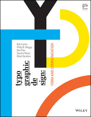
This is a reference book about the history of type design. It provides a detailed timeline that shows how typefaces evolved with the progress of civilization and key historical events. The closer we get to modern times, the more type design becomes widespread and applied to publications and entertainment products.In addition, it explains concepts like type anatomy, legibility, and so on. There are common, widely accepted principles for how to design typefaces, and ultimately, the goal is always to communicate information more effectively.With technological advancements, people have also created typefaces specifically for screens, further enhancing visual impact and even bringing typography into the realm of motion design.
For me, this book feels like a history book about typography itself. It tells the story of how our ancestors refined type design all the way to today’s era of diverse styles and creative freedom.


Comments
Post a Comment