Typography - Task 2: Typographic Exploration & Communication
May 25,2025
TYPOGRAPHY|Task 2:Typographic Exploration & Communications
|| 19/05/25 – 08/06/25 (Week 5-Week 7)
|| Low Xin Er, 0374596
|| Typography
|| Typographic Exploration & Communication/ Type Expression & Type Formatting.
|| Low Xin Er, 0374596
|| Typography
|| Typographic Exploration & Communication/ Type Expression & Type Formatting.
TABLE OF CONTENTS
1.0 Instruction
2.0 Lecturers
3.0 Progress of Work
3.3 Digitalize & Final3.4 Layout explore3.5 Adjustment3.6 Final Design
4.0 Feedback
5.0 Reflection
6.0 Futher Reading
5.0 Reflection
6.0 Futher Reading
1.Instruction
2.Lectures
The complete notes can be viewed at Task1 Blog
3.Progress of Work
Task-2_Editorial
3.1 Research and ideation
3.2 Exploration & Sketch
3.3 Digitalize & Final
FIG.1,2 Title Digitalize by using Adobe Illustrator (23/05/25 week5)
3.4 Layout explore
3.5 Top 2 Adjustments
1.PUNK's design ver1
2.Punk's design ver2, Breaking type design
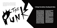
FIG.Final design in pdf format (04/06/25 week7)
HEAD LINE
PUNK's
Typeface: Futura Std
Font/s: Medium Condensed
Type Size/s: 500-300 pt
Leading: -
Paragraph spacing: -
Typeface: Futura Std
Font/s: Medium Condensed
Type Size/s: 500-300 pt
Leading: -
Paragraph spacing: -
THE
Typeface: Futura Std
Font/s: Heavy Oblique
Type Size/s: 110 pt
Leading: -
Paragraph spacing: -
Font/s: Heavy Oblique
Type Size/s: 110 pt
Leading: -
Paragraph spacing: -
Design Revolution:
Typeface: Futura Std
Font/s: Heavy
Type Size/s: 45 pt
Leading: 29 pt
Paragraph spacing: 0
Font/s: Heavy
Type Size/s: 45 pt
Leading: 29 pt
Paragraph spacing: 0
Breaking
Typeface: Univers LT Std
Font/s: 75 black
Type Size/s: 100 pt
Leading: -
Paragraph spacing: -
Font/s: 75 black
Type Size/s: 100 pt
Leading: -
Paragraph spacing: -
the Rules
Typeface: Futura Std
Font/s: Bold
Type Size/s: 42 pt
Leading: -
Paragraph spacing: -
Font/s: Bold
Type Size/s: 42 pt
Leading: -
Paragraph spacing: -
BODY
Typeface: Futura Std
Font/s: Book
Type Size/s: 16 pt
Leading: 18 pt
Font/s: Book
Type Size/s: 16 pt
Leading: 18 pt
Paragraph space after: 3mm
First Line Left indent: -
page 1
Characters per-line: 95-115Alignment: left justified
page2
Characters per-line: 35-45
Alignment: left justified
Alignment: left justified
Margins: 36 px top, 56 px inside + 60 px outside + 36 px bottom
Columns: 3
Gutter: 26 px
Columns: 3
Gutter: 26 px
4.Feedback
WEEK 6
General:
This week, the class was conducted online due to traffic problems. The professor explained the content of Task 2 again and began to allow students to ask questions and give feedback.
Specific:
The layout should also focus on the fluency of reading. Therefore, some layouts have visual effects but are not smooth enough to read. In the title design, it is also necessary to design the entire word together to avoid abrupt problems. For the design of a page, if the page is too simple compared to another page, it will lead to an unbalanced content layout because there must also be design highlights given to the other page where the title is not located.
WEEK 7
General:
This week was a consultation, mainly seeking feedback from the professor and reporting progress. Unexpectedly, the professor made the students' work public and objectively explained the advantages and disadvantages in public, so that other students could learn from it.
Specific:
Since I already had two versions of the design approved by the professor last week and were undergoing final optimization, I could enter the final stage of improvement after simply improving the layout of the paragraphs.
5.Reflection
WEEK 6
For me, the most challenging part of this assignment is how to keep the content interesting yet concise and easy to read. If we only focus on the pictures, it will make the reading feel monotonous. On the contrary, if we only focus on the pictures, it will affect the reading effect.
WEEK 7
For the layout of text paragraphs, I realized that if I want to achieve an almost perfect visual comfort, I need to spend a lot of time adjusting the details and constantly trial and error. My method is that no matter how many times I check in the software, I will open the work in other programs after exporting it, and most of the time I can find the points I missed.
6.Further Reading

This book mainly introduces the commonly used typesetting systems in text design. Axial: design to the left and right of a single axis, radial: deisgn from a central point of focus, dilatational: design along a circular path, random: spontaneous design (random), grid system: design with vertical and horizontal divisions, transitional: design with shifted bands and layers, modular: design with standardized units, biateral: design that is symmetrical to an axis. Although some systems look strange and messy, they can actually shine as long as they are used in the right content design. Therefore, there is no need to use a design system to complete a work, but the content of the work should be the main focus.


Comments
Post a Comment