Jun, 9,2025
TYPOGRAPHY|Task 3:Type Design and Communication
|| 09/06/25 – 28/06/25 (Week 8-Week 10)
|| Low Xin Er, 0374596
|| Typography
|| Type Design & Communication
1.0 Instruction
2.0 Lecturers
3.0 Progress of Work
3.1 Research and ideation
3.2 Exploration & Sketch
3.3 Digitalize & Final
3.4 Layout explore
3.5 Adjustment
3.6 Final Design
4.0 Feedback
5.0 Reflection
6.0 Futher Reading
1.0 Instruction
2.0 Lecturers
3.0 Progress of Work
Progress Sketches
Fig3.1.sketches of a,b,g,t ( 09/06/2025 week 8)
Fig.3.2. 4 types designs (11/6/2025 week 8)
Fig.3.3. sketches of final design series (16/6/2025 week 9)
Fig.3.4.detail dissection of the letters (16/6/2025 week 9)
Observation:
Since font designs have a certain balance and symmetry, the circles or lines used in the insertion process can usually be reused in another part of the symmetry. By disassembling the fonts, I can also better understand the differences and special features of each font in details, which is helpful for me to have a certain foundation when designing my own fonts later.
Fig.3.5 digital skectches progress (18/6/2025 week 9)
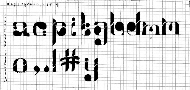
Fig.3.6 digitalise series alphabet,ver1 (21/6/2025 week 9)
Fig.3.7 adjustment of e/p/t/m/o/./#,ver2 (23-25/6/2025 week 10)
Fig.3.8 adjustment of , &. ver3 (25/6/2025 week 10)
Fig.3.9 adjustment of e,ver4 (30/6/2025 week 11)
Fig.3.9.2 measurements (2/7/2025 week 11)
FINAL Task3 : Type Design & Communication
Font Download: https://drive.google.com/file/d/1VR4_0Am4RRDSAcu6zETXMBWFX7pYkYMd/view?usp=sharing
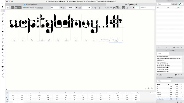
Fig.3.10 Fontlab screenshot (7/7/2025 week12)
Fig.3.11 Final Task 3A: Type Design and Communication "SemiWind" - JPEG, (10/7/2025 week12)
Fig.3.12 Type Design and Communication "SemiWind" - PDF, (10/7/2025 week12)
Fig.3.12 "SemiWind" Typo poster A4 - JPEG, (14/7/2025 week12)
Fig.3.13 "SemiWind" Typo poster A4 - PDF, (14/7/2025 week12)
4.0 Feedback
Week 8
General:
The course mainly explains the content of Task 3 and introduces the practical functions of Procreate to assist in completing the assignment. The font system is reviewed again to avoid unnecessary mistakes when designing fonts.
Specific:
The professor was very satisfied with the two designed fonts and felt that they met the assignment standards. After selecting one of the designs, he began to design a complete series.
Week 9
General:
The professor taught us how to set up the font design framework system in Adobe illustrator. The biggest gain is that font design does not require pure lines or regular circles, and can be adjusted at will, because the ultimate goal is to make the digital font as close to the draft design as possible.
Specific:
I designed a series of letters based on the optimal design plan decided by the professor last week. Except for the need to adjust the details such as the letter t, the overall design is fine. Therefore, I can start the digitization of the design. As for the disassembly analysis of the letter design, although the set lines are messy, some complex letters can be decomposed.
Week 10
General:
This week's class mainly allows students to ask professors for feedback to continue the font design.
Specific:
The letters also need to be unified in details. The letters e, o, m and # need to be redesigned, while a, p, t need to adjust the details. There are no problems with other letters. After the modification, feedback was asked for the second time. Currently, only the letter o and punctuation marks need to be further improved.
Week 11
General:
This week's class mainly allows students to ask professors for feedback to continue the font design.
Specific:
Modify the letter e until it is readable. Adjust the size of the letter and you are ready to import it into the font creation software. Student can start watching the tutorial in advance to prepare for the next lesson.
Week 12
General:
Demonstrations on how to use fontlab, such as adjusting the size and position of imported fonts and perfecting the spacing when using fonts.
Specific:
For my font design, the spacing between each letter needs to be increased for better reading. After completing the font adjustment, the next step is to use the font to create a black and white poster.
Week 13
General:
Consultation week.
Specific:
The letters used in making the poster should include all the letters designed in the assignment, and the layout should be harmonious. Next, you need to complete task 4, which is to summarize all the assignment results and write a reflection.
5.0 Reflection
Week 8
The most important thing for me when designing a font is not to have a unique style, but to keep all the letters in the same style. As the Internet is now well developed, the demand for font design is expanding, and font designs will only become more and more similar. Therefore, a good font can make people see at a glance that it is of the same style and achieve a pleasing level.
Week 9
It is not easy to disassemble a font because you have to take care of many details, but it is also very rewarding to successfully imitate a font. The process of designing fonts also makes me more proficient in mastering font styles, such as knowing where to adjust to make the font more in line with the characteristics of the style without affecting readability.
Week 10
I continue to modify and improve my font design. In order to unify the style of all letter designs, I modified several letter designs that were not stylish enough. I feel a sense of accomplishment watching the letter series become more and more perfect, and I am more proficient in the operation of Adobe Illustrator. I look forward to the works using these letters.
Week 11
This week I mainly refined the letter design details and started adjusting the size of the overall letter series until it was suitable for importing into the font making software. The whole process was very tiring but also gave me a certain sense of accomplishment.
Week 12
There are generally no problems in the font design process. After understanding the operation of fontlab software, I imported the font and made fine adjustments. Next, I will use the font to create a black and white text poster.
Week 13
I have finished designing a black and white poster with letters by myself, and this week I started to summarize and review all the previous assignments, which means that the semester is coming to an end.

In this book, I realized how important standard sizes and modular thinking are in design. It’s not just about making things look good, but also making them practical and efficient. Using standard sizes in paper or materials can save a lot of money, time, and effort. I also learned that good design doesn’t mean it has to be expensive. It means finding the smartest, most balanced solution.
As a design student, this reminds me to pay attention to every detail as from the size of shapes to the textures and colors I choose. These choices build up my personal style over time. The writer also mentioned that freedom in design comes from knowledge and structure, not just doing whatever I feel like. That really stayed with me.


Comments
Post a Comment