Illustration & Visual Narrative - Task3 Animated Composition
June 10, 2025
Illustration & Visual Narrative
|| Low Xin Er (0374596)
|| Week 8-Week 10 ( 10/6/25 - 28/6/25 )
|| Week 8-Week 10 ( 10/6/25 - 28/6/25 )
________________________________________________________________________________
Table of Contents
1.0 Lectures
1.2 Fore/Mid/Background
1.3 Chiaroscuro
2.0 Tutorials
2.1 Pattern
2.2 Gradient & Texture
2.3 Animation psd-ae
3.0 Pratical
3.2 Sketch & Exploration
3.3 Digitalize
3.4 Final Overall Artwork Design
3.5 Accessories Design
3.6 Animation Design
3.7 Documentation


Arrange all the elements in the Pattern Workshop artboard (10cm x 10cm)
Method 1: Hold Alt + Click & drag the shape up (you will see a blue line)
Method 2: Select the object with the circle at the end, Copy & Paste in Front (Ctrl + C > Ctrl F)
Change the TOP shape into a darker color.

Go to Window > Transparency and click ‘Make Mask’. Untick ‘Clip’.
Select the Mask thumbnail (highlighted in blue)
Draw a box that covers the whole shape.
Choose the Gradient Tool or Press G
Choose the Freeform Gradient
Click & delete the top right & bottom right circles.
Double click the top left circle and choose Black
Double Click the bottom left circle and choose White


Click the white circle first, then click other areas that are supposed to be dark
Click the black circle next, then click other areas that are supposed to be light/brightGo to Effect > Texture > Grain
Brushes – Calligraphy, Scatter, Art, Bristle and Pattern
Double Click the Paintbrush Tool.
Increase the Fidelity to the far right option (smooth)
Do the same for the Pencil Tool.
Calligraphic Brush
you can only directly using the calligraphy brush using the brush tool [ B ].
If you want to use the Calligraphy brush using Pen OR Pencil tool, you have to apply AFTER you draw the stroke.
Scatter Brush
Disperse copies of an object (like a leaf or a bug) along a path. This can create a unique pattern and is perfect for creating an edge or borders.
To create a scatter brush, you need to first select an object OR a group of objects as a base for the scattering.


For finer adjustments, you can further edit the brush by double-clicking on the brush’s thumbnail
Turn on the preview to see the changes in real time.
The Illustrator art brush pen allows you to stretch a brush shape or object shape and disperse it evenly across a path.
Use the pencil object that has been provided for you, create a new art brush.


With Illustrator’s pattern brush, you can create a pattern of individual tiles that will repeat along a path. This can include up to five tiles.
To make multiple ends of pattern (start, middle and end) we need a registration box.
Change the box’s fill and stroke to none.
Bristle Brush
Illustrator’s bristle brush enables you to create bristle brush strokes that have the appearance of a brush with bristles like you would see with a paintbrush.
For bristle brush, we only need to load the Brush Library that is stored in the menu settings.
Bristle brushes are meant to give users the experience of painting using pressure sensitivy and create brush strokes that looks and feel realistic.


If you look at the properties, you’ll notice that the Width (W) and Height (H) is set to 2000 px and 1000 px respectively.
The required resolution for submission output is still 6000 px X 3000 px.
By using simple mathematics, we can scale the artwork up 3x upon export, so that we get the required resolution.
Separate Your Objects Into Individual Layers

Merging Groups Into Layers

Now our Project panel has a content inside.
Import PSD
Rearrange
Resizing the background

Let’s hide everything else and reveal the character
Reveal the keyframes
Animate the Pins At 04:00f
Details
Rendering the Animation Output (.MP4)
________________________________________________________________________________


3.2 Sketch & Exploration


 Fig.Progress of using adobe illustrator
3.4.1 Feedback from professor.jpeg)

3.5 Accessories Design by using photoshop


4.0 Reflection


1.2 Fore/Mid/Background
________________________________________________________________________________
1.Lectures
1.1 Perspective


________________________________________________________________________________
2.Tutorials
Make sure they are evenly spaced.
sample artboard size is 10cm x 10cm > add/minus 10 to the value of X (Horizontal) or Y (Vertical)
moving elements until balance looks natural


Make a 10x10cm rectangle and align it to the artboard
Select all of the objects we just arranged together with the square we just made
Go to Pathfinder > Crop

Open Swatches Panel (Window > Swatches)
Drag the pattern into the Swatches Panel.
The objects highlighted will need to be mirrored.
Copy & Paste In Place all of the objects.


sample artboard size is 10cm x 10cm > add/minus 10 to the value of X (Horizontal) or Y (Vertical)
moving elements until balance looks natural
Make a 10x10cm rectangle and align it to the artboard
Select all of the objects we just arranged together with the square we just made
Go to Pathfinder > Crop
Open Swatches Panel (Window > Swatches)
Drag the pattern into the Swatches Panel.
Done
Adding Texture
Method 1: Hold Alt + Click & drag the shape up (you will see a blue line)
Method 2: Select the object with the circle at the end, Copy & Paste in Front (Ctrl + C > Ctrl F)
Change the TOP shape into a darker color.
Go to Window > Transparency and click ‘Make Mask’. Untick ‘Clip’.
Select the Mask thumbnail (highlighted in blue)
Draw a box that covers the whole shape.
Choose the Gradient Tool or Press G


Click & delete the top right & bottom right circles.
Double click the top left circle and choose Black
Double Click the bottom left circle and choose White
Click the white circle first, then click other areas that are supposed to be dark
Click the black circle next, then click other areas that are supposed to be light/bright


Double Click the Paintbrush Tool.
Increase the Fidelity to the far right option (smooth)
Do the same for the Pencil Tool.


you can only directly using the calligraphy brush using the brush tool [ B ].
If you want to use the Calligraphy brush using Pen OR Pencil tool, you have to apply AFTER you draw the stroke.


Disperse copies of an object (like a leaf or a bug) along a path. This can create a unique pattern and is perfect for creating an edge or borders.
To create a scatter brush, you need to first select an object OR a group of objects as a base for the scattering.
can draw with the Paintbrush Tool, but I’ll be using the rectangle tool in this example just for variety.

For finer adjustments, you can further edit the brush by double-clicking on the brush’s thumbnail
Turn on the preview to see the changes in real time.

Art Brush
The Illustrator art brush pen allows you to stretch a brush shape or object shape and disperse it evenly across a path.
Use the pencil object that has been provided for you, create a new art brush.

Pattern Brush
With Illustrator’s pattern brush, you can create a pattern of individual tiles that will repeat along a path. This can include up to five tiles.
To make multiple ends of pattern (start, middle and end) we need a registration box.
Change the box’s fill and stroke to none.


For bristle brush, we only need to load the Brush Library that is stored in the menu settings.
Bristle brushes are meant to give users the experience of painting using pressure sensitivy and create brush strokes that looks and feel realistic.

Brief: Task 3: Animated Composition – 20%
Criteria 1: Overall Visual Design & Merchandise Design (10%)
Criteria 2: Final Animated Content (8 – 10 seconds) (10%)
Theme:

https://www.honor.com/my/honor-talents/global-design-awards/gallery/
Submission:
Accessories Design – 6000 x 3000 pixels in JPG
Overall Visual Design – 6000 x 3000 pixels in JPG
Animation Design – 1920 x 1080 pixels in MP4 Format (Size below 20Mb)
Documentation – PDF, A4. Moodboard & Rationale


Criteria 1: Overall Visual Design & Merchandise Design (10%)
Criteria 2: Final Animated Content (8 – 10 seconds) (10%)
Theme:
https://www.honor.com/my/honor-talents/global-design-awards/gallery/
Submission:
Accessories Design – 6000 x 3000 pixels in JPG
Overall Visual Design – 6000 x 3000 pixels in JPG
Animation Design – 1920 x 1080 pixels in MP4 Format (Size below 20Mb)
Documentation – PDF, A4. Moodboard & Rationale
Animation can be just simple motion like motion effect.
week9 - tutorials
If you look at the properties, you’ll notice that the Width (W) and Height (H) is set to 2000 px and 1000 px respectively.
The required resolution for submission output is still 6000 px X 3000 px.
By using simple mathematics, we can scale the artwork up 3x upon export, so that we get the required resolution.


Separate Your Objects Into Individual Layers
- Select the main layer ‘STARS’ and click the Layer Options panel (hamburger menu). Choose ‘Release To Layers (Sequence)’.
- Rename Layer 6, 7, 8 into STAR 1, STAR 2, STAR 3. (This is important because we can’t tell apart the layers in After Effects, so we can only tell by the layer’s name.)
- Drag the layers OUTSIDE of the layer ‘STARS’ and then delete the original ‘STARS’ layer.
- Now we’re ready to export to .PSD file.
- Double check if your document is in RGB mode.
- CMYK is for Printing
- RGB is for Screens & Animation
- After making sure the Color Mode is in RGB, go to File > Export > Export As

- Choose ‘Photoshop (*.PSD)’ in the Save as type option on the Export window.
- Ensure that the ‘Use Artboards’ options are unticked. If ticked, the export will crop/remove everything outside the Artboards.

- Since this is for ANIMATION, the resolution will need to be set for Screen and that’s 72ppi.
- No need to worry since our artboard is 2000px, as long as we don’t scale the size bigger in After Effects, we won’t experience any quality loss.
- Now let’s open the exported file in Adobe Photoshop. Just double click the file.
Merging Groups Into Layers
- To merge a group into a flat layer in Adobe Photoshop, just select the parent group (Largest group), and press [ Ctrl + E ].
- Keep on merging all the parent group until you have the layers, similar to what we have in Adobe Illustrator just now.
Adobe After Effects
- Creating a new project just give you a starting window WITH the Project panel.
- The ‘Project’ panel is like your personal library, you can import your documents into the project Panel.
- We want the project panel because we want to be able to see all of our imported files.
- Click on the ‘New Composition’ button.
- Change the Composition Name to anything that you want.
- Choose the preset HD · 1920x1080 · 24 fps.
- Make sure the ‘Pixel Aspect Ratio’ is set to ‘Square Pixels’.
- Check if the Frame Rate is 24.
- Set Duration to 0:00:10:00
- Make sure the Background Color is set to Black.
- Click “OK”
Now our Project panel has a content inside.
- This composition is an empty shell of a video.
- This is the composition that we’re going to add our illustration into.
Import PSD
- You can import files by going to File > Import > File in the menu; OR
- You can just drag and drop the file INTO the Project panel.
- Choose: Import As: “Composition – Retail Layer Sizes”.
- Choose “Merge Layer Styles into Footage”
- Check the Project panel, ALL YOUR LAYERS should be inside a folder.
- Next we’ll delete the composition that was made automatically during the importing process.
- Click on the Week09_AnimationAsset composition, and click the trash bin icon below the Project panel OR press [ Backspace ] or [ Delete ]
- Click ‘OK’ on any pop up that appears afterwards.
- Expand the group ‘Week09_AnimationAsset Layers’ and make sure that your layers are all secured.
- Let’s bring the layers INTO the Week09_Animation composition we created earlier.
Rearrange
- Select all of the Photoshop file, and drag INTO the comp below. Make sure the comp is the one you make earlier.
- If somehow the composition is not loaded properly in the timeline, just double click the composition we made earlier, it should load then.
- You may need to rearrange the layers according to the original file.
Resizing the background
- Set the view to 50% so we can see extra space around our composition. You may need to go below 50% depending on your screen resolution.
- Using the Selection Tool [ V ], click on the background and it’ll automatically select the layer.
- Click on the side point, and drag to the side to make it wider.
- Since this is an abstract background, it’s ok to stretch it like this.
- Enlarge the stretched background so there’s no black areas left (fill the whole document) You can eyeball all this
Setting the initial position for our background.
- On the timeline, with the BG layer selected, press [ P ] to show the [Position] properties.
- Click on the stopwatch silhouette to create a keyframe on the 00:00f position on the timeline. Notice the diamond shape appear, that’s a keyframe.
- On the Composition view, click on the background, hold SHIFT and drag to the side. DO NOT MOVE THE BLUE TIMELINE INDICATOR.
- Go back to 00:00f, and press [ Spacebar ] to preview the animation. If you did everything correctly, you’ll see the background move.
- Depending on how much you stretch your background will determine the speed of your animation.
- (Longer stretch, faster movement | Shorter stretch, slower movement)
- Select all the other layers, click on the > icon besides the colored box to close all the properties.
- Click on the eye icon to hid everything, and click on the panda’s eye icon to reveal it.
- To start with, go to 00:00f again, so that we’re right at the beginning. Make sure the PANDA layer is selected.

- Using the Puppet Position Pin Tool, click on the points shown in the image below. PANDA layer should still be selected!

- Every time you create these ‘pins’, the layer will create a keyframe,that’s why it’s CRUCIAL to set the blue indicator back to 00:00f.
- Let’s copy these keyframes to 10:00f so the beginning and the end is the same.
Reveal the keyframes
- Select the PANDA layer, press [ U ] – which will reveal ALL PROPERTIES WITH KEYFRAMES.
- Select all the keyframes and press CTRL + C
- Go to 10:00f and press Ctrl + V
Animate the Pins At 04:00f
- Go to 04:00f or 04s and click on ANY empty area – This will deselect all the puppet pins at once.
- Then select the pins individually and start moving them around. Make sure you move all of the pins. BE MINDFUL NOT TO MOVE THE PINS TOO FAR ELSE YOUR ANIMATION WILL LOOK LIKE A MESS.
Details
- We will need to apply easy ease to the animation so that the motion moves smoothly.
- To do so, select ALL layers and press [ U ].
- Highlight ALL the keyframes, right click > Keyframe Assistant > Easy Ease
Rendering the Animation Output (.MP4)
- To export/render to .mp4, make sure you have the composition selected and opened.
- Go to File > Export > Add to Render Queue
- Click on the ‘Output to’ option (blue link) and name your file
- Click Save
- Click on the Render button and wait until the render finishes.
________________________________________________________________________________
3.Pratical
3.1 Research& Reference


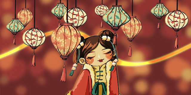
Fig.Chinese lanterns cultural and chinese traditional custom girl
3.2 Sketch & Exploration


3.3 Digitalize by using Adobe Illustrator


3.4 Overall Artwork Design


Fig.Sketch of composition
3.4.1 Feedback from professor
.jpeg)
Fig.Composition should be more balance by moving some elements

Fig.Adjustment: Balance of composition
3.5 Accessories Design by using photoshop

3.6 Animation Design by using After Effects

Fig.Progress of using adobe after effect
Fig.Final animation
3.7 Documentation (moodpboard & rationale)

____________________________________________________________________________________________
4.Reflection
Week 8
This week, I learned the skills and functions of making continuous patterns. After setting the layout of the elements, I can make a pattern and reuse it in a large area, which is very practical. In addition, I also learned how to add sand effects to elements to make the work more refined, and how to make unique brushes by myself, which can even be used to make border designs.
Week 9
This is my first time using the software After Effect. Although the interface looks complicated, once you understand how to use the functions, you will find that you only need a few simple steps to create the desired animation effect. This time, the assignment for the Honor competition also requires designing a poster, so I need to use the layout skills, color adjustment and other skills used in the previous assignment again.
Week 10
This week, I used a lot of different software, from Adobe Illustrator to design illustrations, to Photoshop to organize layers, to After Effects to create simple animations. This assignment seemed complicated at first, but after understanding the specific operations, I found that it was not difficult and I could create a very ideal work. This work was a very good experience for me.


Comments
Post a Comment