ADVANCED TYPOGRAPHY / TASK 3: TYPE EXPLORATION & APPLICATION
ADVANCED TYPOGRAPHY / TASK 3: TYPE EXPLORATION & APPLICATION

Low Xin Er / 0374596 / Bachelor of creative media
2.Digitalise Curtyane typeface
3.Font Presentation & Application
4.Final Font Design
5.Feedback
6.Reflection
7.Further Reading


- Most of the original cookie font was too realistic and 3D, making it difficult to use on digital products. Therefore, the focus was on improving the style, including the borders and colors.
- Use elements such as cookie textures, holes, and lace as design elements for the font. It can be in black and white or in cookie colors.
- It can be used in tea parties or any product related to baked cookies.


- The drape and pleats of curtains change shape with force or fixation. The dynamic movement of their swaying ends can also serve as excellent design elements for text.
- This can be applied to products related to home and stage performances.


- The characteristic of paper-cutting art is that it involves subtracting numerous small shapes from an existing flat surface to create a graphic, revealing the graphic while simultaneously showing the content behind it—a semi-concealed design. Similar to paper-cutting, lace, and tailoring, these designs can be used in handicrafts and cultural products.
- Based on a tailor-like design, the font uses the characteristics of paper-cutting art, leaving space between each shape, like a font composed of a pattern.
- For the "Curtain" font, could find a relevant curtain company to design the font for them.
- For the third font, "Paper Cut," a more angular, diamond-shaped design would be better.


 Fig.2.6 progress (26/11/2025, week 10)


 Fig.2.9 digitalised in Adobe Illustration (28/11/2025, week 10)
- The thickness of uppercase and lowercase letters should be the same. The size of numbers and punctuation marks should follow the same design as uppercase letters.


 Fig.3.7 font application- all mockup (14/12/2025, week 12)
 Fig.3.8 5 font presentation (14/12/2025, week 12)
 |
Fig.4.1 Final Font Design |
https://drive.google.com/file/d/18IXwticMa7YfDmRRzaxXIc72NMJC--ay/view?usp=sharing


- Dont try to squeze all your letters into one artboard for your font presentation, the forn you designed needs to be displayed big.
- The hat is out of place, wrong choice - rethink.


- Whether you are a student now or working in the future, you should follow the instructions in the brief instead of thinking that your design is unique but does not solve the customer's problem.
- For the "Curtain" font, could find a relevant curtain company to design the font for them.
- For the third font, "Paper Cut," a more angular, diamond-shaped design would be better.
- Remember to save the entire design process of your work.
- Good. Record the entire design process of your work.Continue with lowercase and punctuation design.
- Adjust the spacing between letters to avoid awkward blank spaces created by curved letters and achieve visual balance.
- Review the YouTube tutorials on using Fontlab.
- Adjust according to the letter spacing reference table.
- The thickness of uppercase and lowercase letters should be the same. The size of numbers and punctuation marks should follow the same design as uppercase letters.
- The thickness of uppercase and lowercase letters should be the same. The size of numbers and punctuation marks should follow the same design as uppercase letters.
- The weight of lowercase letters should be the same as that of uppercase letters.
- Regular letters should be larger than uppercase letters to avoid looking like a C.
- Commas should have the same diameter as the letters, including question marks, exclamation marks, and the dots around the letters i and j.
- Before adjusting spacing in FontLab, enable preferences. When copying, use AI technology to automatically aim and maintain the position. Refer to YouTube tutorials.
- The lowercase letters look much better after adjusting the thickness.
- The letter Q could be made thinner.
- For font usage, can refer to the KLpact event, using similar themes as a reference.
- Dont try to squeze all your letters into one artboard for your font presentation, the forn you designed needs to be displayed big.
- The hat is out of place, wrong choice - rethink.
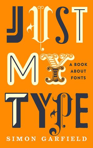
Just My Type is a fun and surprising book about fonts and how they shape the way we feel and see the world. The author doesn’t just list typefaces, he tells stories about them. I learned why some fonts like Comic Sans make people roll their eyes, and why Helvetica became so famous. The book talks about how fonts carry personality and meaning, like how a font can look serious, calm, playful, or old-fashioned without using words. It helped me see letters as more than shapes on a screen. Instead, they are expressive tools that change the mood of a design. The writing is easy to read, with real examples from everyday life that make the ideas stick. After reading this book, I feel like I can choose type with more purpose and understand why good typography matters in design. It made me more aware of the fonts around me.


Comments
Post a Comment